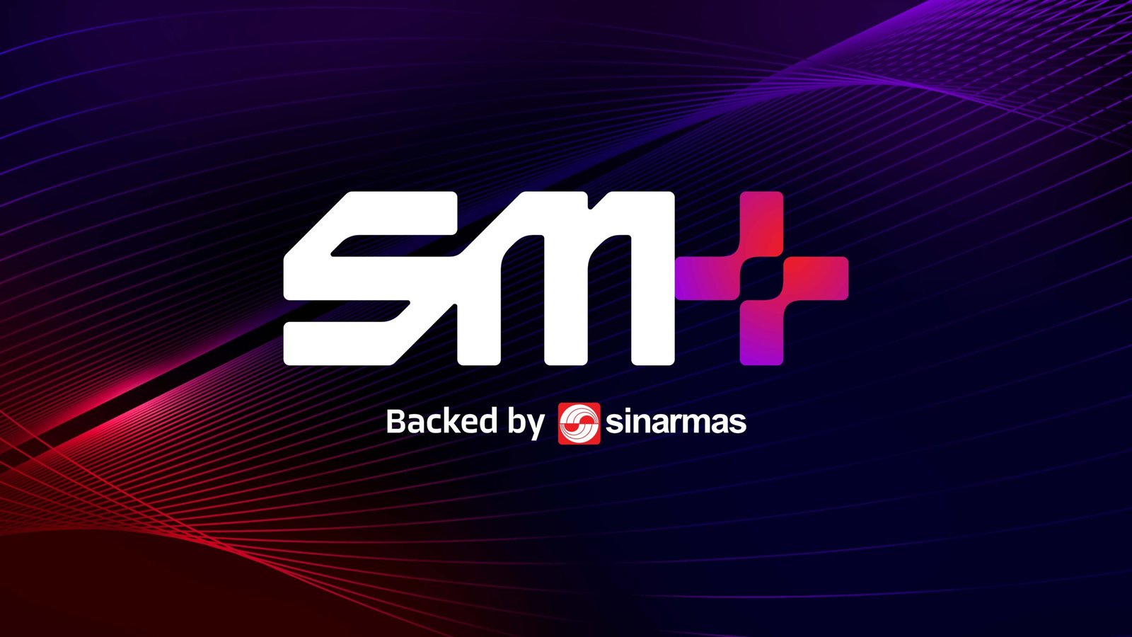
Shaping a distinct, future-ready identity for SM+ was an exciting challenge for Kiilat Creative. Tasked with creating a brand that represents SM+’s expertise in data centres, technology solutions, and interconnection services, we aimed to craft an identity that embodies innovation, security, and growth. As a key partner of Sinar Mas, SM+ required a cohesive and impactful brand presence that positions it as a leader in the rapidly evolving digital economy while staying true to its visionary mission.
SM+ is built on three foundational pillars: SM+ Holdings, Data Centers, and Technology Solutions, which collectively power its mission to drive digital transformation. To articulate these pillars, we designed a brand identity that emphasizes innovation, trust, and scalability. The bold SM+ logo, anchored by the "+" symbol, represents progress, connection, and forward-thinking technology.
Paired with the tagline "Powering the Digital Future," which we developed to encapsulate SM+’s mission, the brand story conveys a sense of authority, purpose, and optimism. Additionally, our strategic copywriting for the SM+ website ensures the brand’s vision is communicated consistently and resonates with its audience across the digital space.
The SM+ identity is brought to life through modern, purposeful icons and a dynamic color palette. Each custom-designed icon communicates the technical expertise of SM+ while maintaining clarity and functionality. The color palette, led by SM+ Blue and enhanced with vibrant gradients of purple and red, symbolizes trust, agility, and innovation. These colors set a bold, futuristic tone while aligning with the legacy of Sinar Mas. Together, the icons and colors create a striking, cohesive visual language that ensures SM+ stands out in the competitive digital landscape.
We ensured the SM+ brand identity was versatile and impactful across all applications. From corporate essentials to large-scale visuals, every touchpoint reflects SM+’s professional and innovative ethos. The brand pattern, derived from the "+" symbol, adds depth and dynamism, seamlessly integrating into key assets such as ID cards, business cards, branded shirts, the website, and billboards. Additionally, we contributed to tagline creation and strategic copywriting for their website, ensuring the SM+ voice is consistent, modern, and compelling. Every element reinforces SM+ as a forward-thinking leader, powering businesses and enabling growth in the digital era.