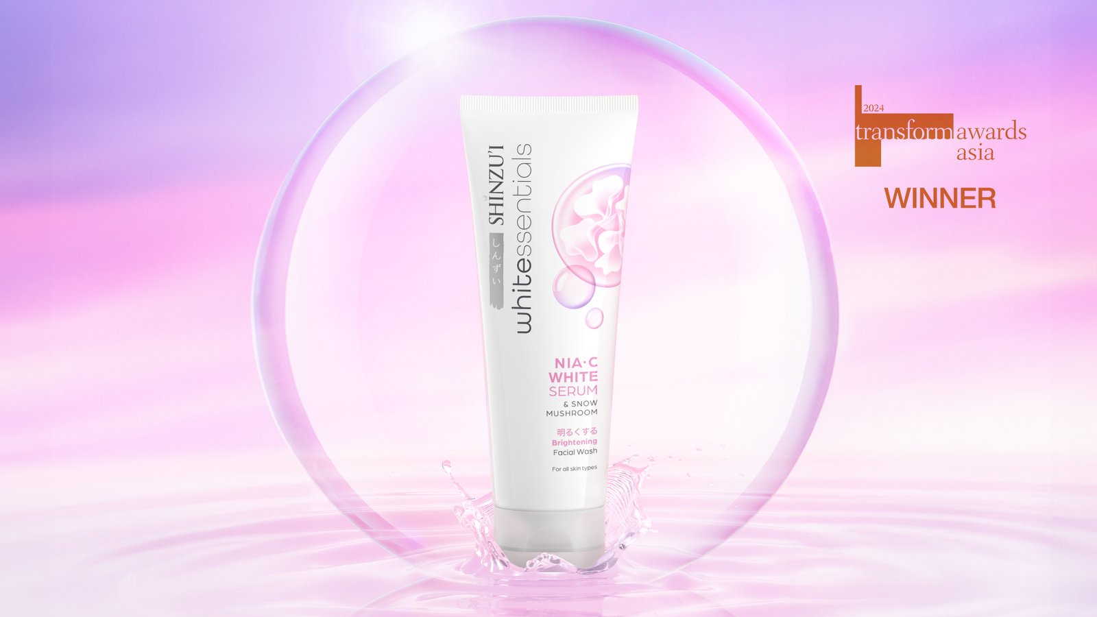
For over 20 years, Shinzu’i', a personal care brand based in Indonesia known for its skin-brightening benefits, has been a household staple, trusted by millions. With the enduring success of Shinzu’i, our Client seeks to extend their offering by introducing “Whitessentials”, a new innovative, skincare-driven functional line, targeting consumers looking for affordable yet high-quality skincare incorporating Japanese formulations and natural brightening ingredients. Our first task was to create a sub-brand logo that works harmoniously with the Shinzu’i master logo. Emphasizing on the word ‘white’ to reinforce the skin brightening benefits of the brand, done with a humanistic rounded typography that evokes a gentle touch and Japanese influences.
BRONZE 2024 TransformAsia Awards
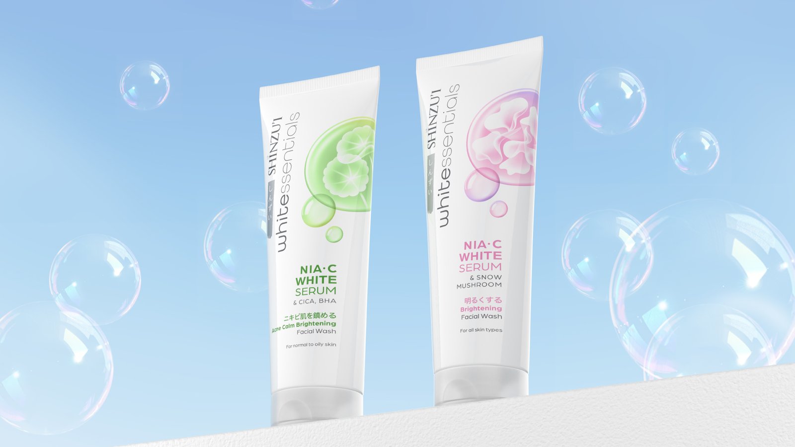
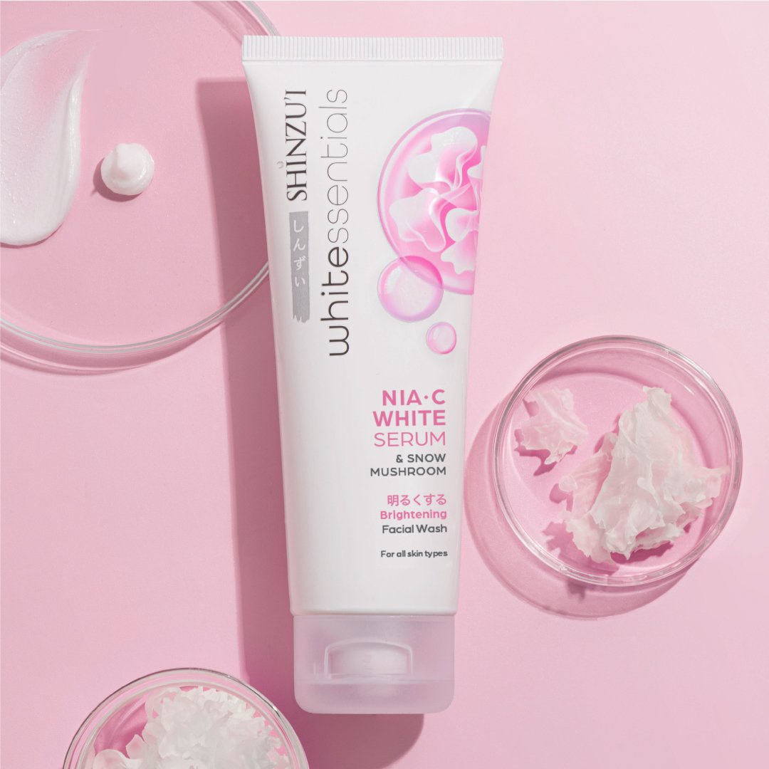
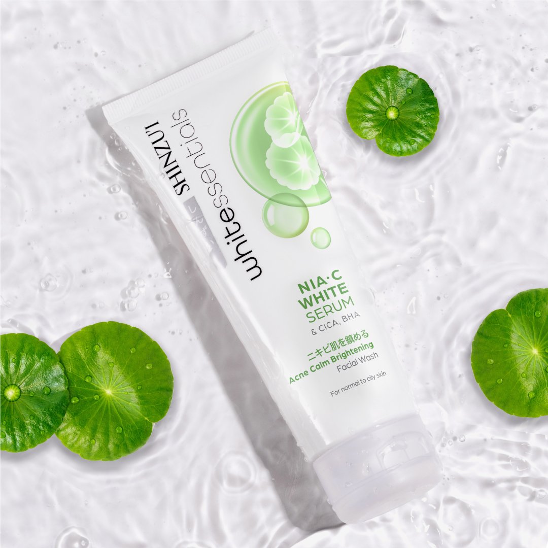
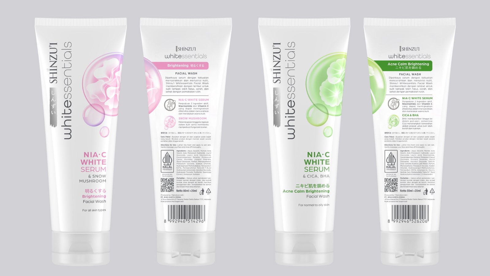
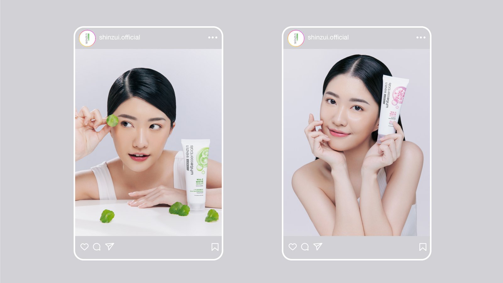
Drawing inspiration from the Japanese aesthetics of simplicity and clean negative spaces, along with the vibrancy of Korean skincare brands and effective call-out of star ingredients, we crafted a modern look that stands out both on the shelf and in the bathroom. The result is an efficacious packaging design that effectively communicates the brightening function of the products while showcasing the active ingredients with clarity and distinction, all whilst keeping in mind the Shinzu’i brand DNA (Japanese-inspired, predominantly white, with an elegant, feminine look and feel).
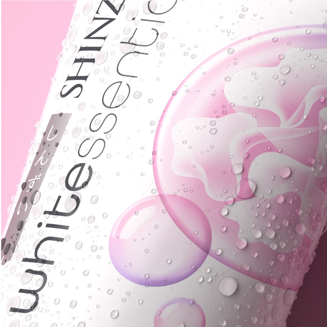
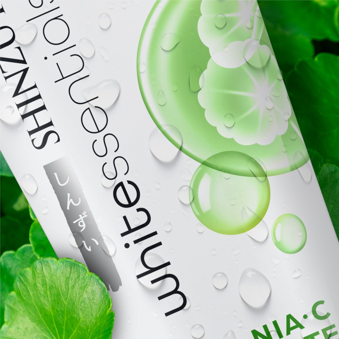
The key visual feature on each variant is a bespoke bubble graphic uniquely crafted specially for the Shinzu’i Whitessentials brand. It artistically portrays the active ingredients in an abstract manner, showcasing fluidity and beauty that combines skincare science and natural elements. The bubble graphic suggests the product's core usage as a facial cleanser that appears functional yet gentle in its nature.